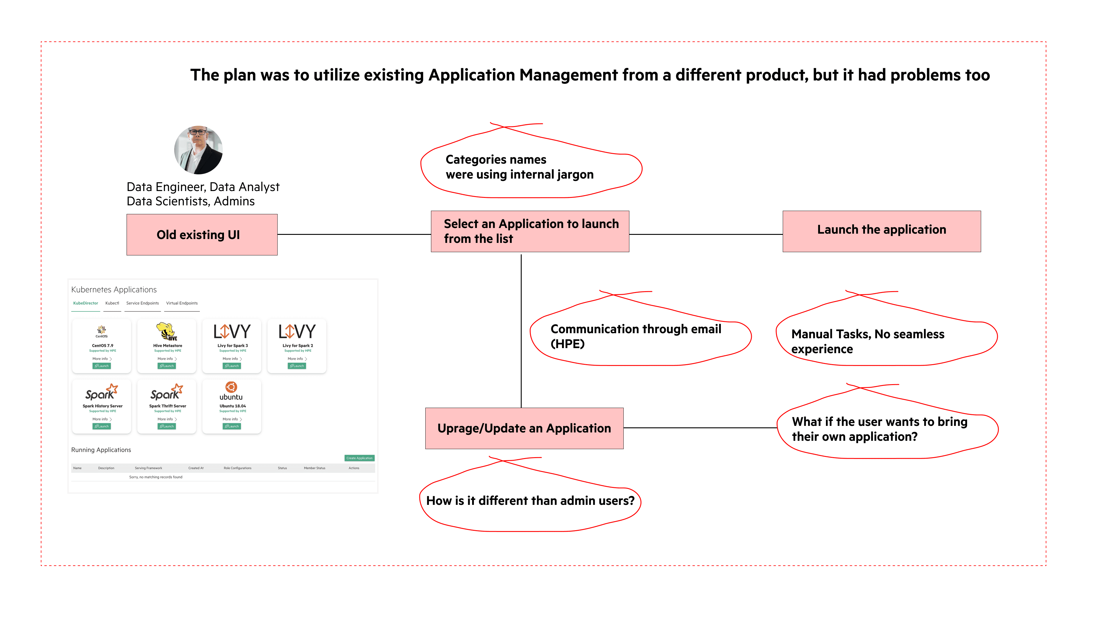
What's happening curently..
Users can upgrade their apps, but the current process contains a lot of manual steps. They also need to ask HPE (Hewlett Packard Enterprise) about any available upgrades, as they cannot get notified about new versions. Current industry applications have better application lifecycle management but still involve manual inputs from the user. We had scoped the application and framework for the GA release, not the initial BETA release for the Unified Analytics. We saw this need as I spoke to users and saw this as a necessity. Also, in terms of the product strategy, this became one of the core features of UA i.e. to list all the open source applications and bring them to UA so that the user does not have to worry about different tools. They could get the tool of their choice and analyze those.
The goal
Allow users to view all the open-source applications in one place
Create a lifecycle for applications and frameworks with the user’s choice of tools
Increase customer satisfaction by providing an easy way for our customers to upgrade their apps.
Increase sales by demoing/advertising “easy, automated upgrades” to potential customers thereby increasing adoption.
What I shipped...
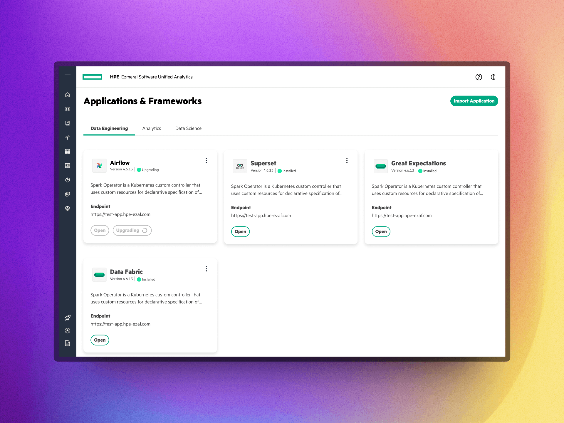
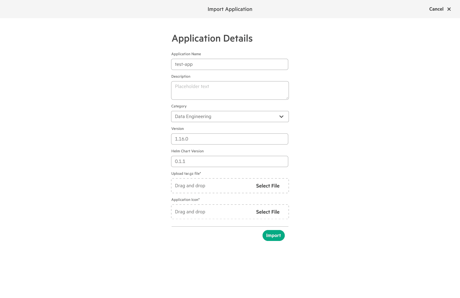
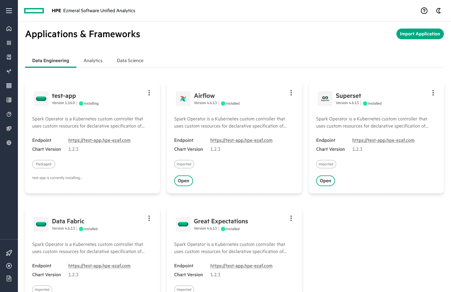
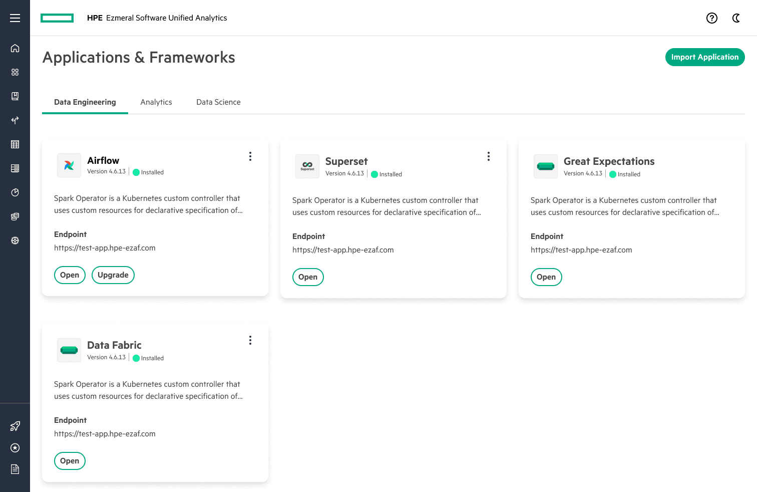
I designed an application and framework management lifecycle for the Unified Analytics product. This workflow is used by data engineers, analysts, and scientists. Admins have extra features such as the configuration of applications which is hidden from other personas. I accounted for these use cases, and edge cases which shaped the product accordingly.
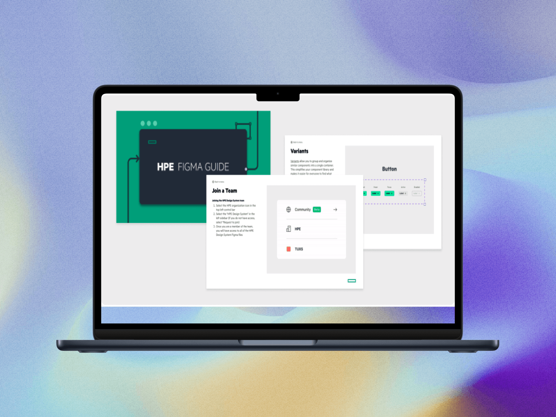
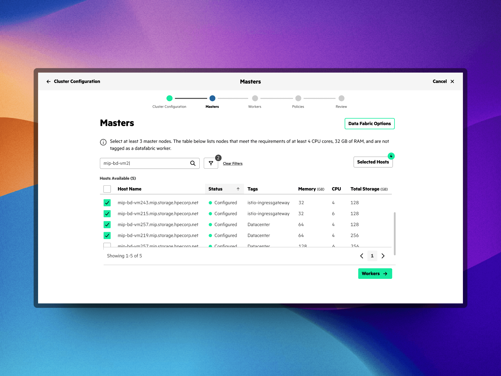
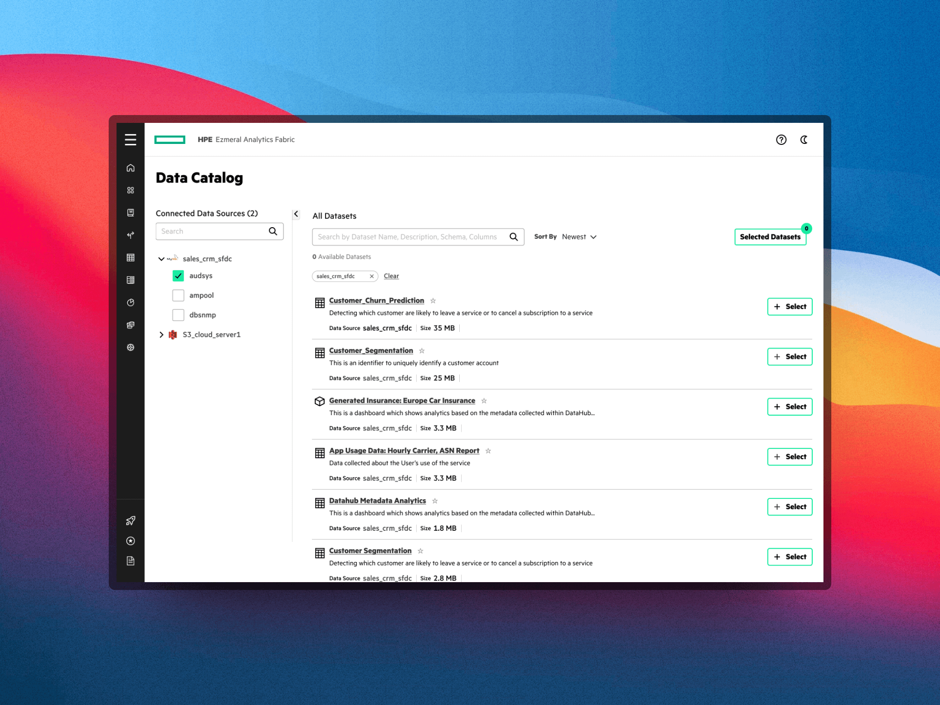
Some screenshots of Hi-Fidelity prototypes
How I got here...
I collaborated with the product manager, head of product, and engineering lead throughout my design process. I influenced the product by following a data-driven and iterative approach and being the advocate of the users. This helped me and the time to strategize certain features should have and not have and this is where user stories came into the picture. Since I have worked on the navigation and information architecture before, it was clear to us where the feature would be projected into the product. Moreover, talking to users and contextual inquiries was beneficial as I had the data to back up my designs and rationale.
This helped the team to create a goal and success metrics. We kept this feature a high priority as this was the most requested feature from the customers. I iterated multiple times, kept everybody in the loop, and communicated my designs by prototyping. The card component which I created previously was helpful as I had thought about scalability when I was designing the component. Since this was high priority feature, I had to ship the designs quickly in an agile manner. I also conducted quick RITE(Rapid Iterative Testing and Evaluation) with 10 users and gather feedback which was later incorporated.
Design principles like "Making interfaces easy and intuitive to use" helped me think about micro-interactions that make it user-friendly giving appropriate status updates to the user. After all, I was the advocate of making the product consumer-grade while trying to solve enterprise users’ complexity.
